
Project:
Ecgo is a recycling app that encourages college students to recycle by rewarding them with incentives like gift cards.
I led user research and facilitated a co-design workshop to uncover user pain points, redesign the 'item submission' flow and leaderboard, and craft contextual messaging pop-ups, enhancing clarity and creating a smoother user experience.
Role: UX Strategist | UX Researcher
Duration: 4 Months
Background
After a year of user engagement, Ecgo noticed a drop in long-term user retention and they decided to conduct user surveys with low, medium and highly engagement users.
My role was to decode - what are the challenges faced by ecgo users?
Deciphering the data from the user-survey
As I dug into the survey data, three core pain point patterns rose to the surface - Technical, Usability and Psychological.

Technical Painpoints: App crashing, issue with visibility of deleted items, and camera glitches with focus.
Usability: like unclear AI predictions and a tedious recycling process that frustrates users.
Psychological: Too much effort, not enough payoff.


4+ Online User Interviews: Highlights how participants recycle with ecgo, their motivations and thoughts on the app and challenges.
From the 1:1 online interviews I was seeking answers for -
-
What is the users background with respect to recycling?
-
What motivates our users to use ecgo?
-
How do they use ecgo?
-
What are their major frustrations?

What I learned..
1. User Background
It was noted that most highly engaged users were already recycling before they started using ecgo.
2. User Motivations
Identified two primary user motivations: the strongest being the desire to earn gift cards. However, top users also shared that they already recycle regularly and view the extra cash as a nice bonus rather than the main incentive.
3. Ecgo Usage
Data analysis showed that top recyclers submitted more items than the number of days they used the app, suggesting possible bulk submissions. However, user interviews revealed:
-
Some users recycled on the go.
-
Others preferred to collect recyclables and recycle them in batches.
Major Frustrations


-
The global leaderboard feature was not well-received due to its finicky nature.
-
There were 2 types of persona:
-
Competitive users - consisted of top 10 in the leaderboard.
-
Non-competitive - the rest of the users on leaderboard.
-
-
Users often felt lonely and expressed they wanted to compete against friends and other colleges.

-
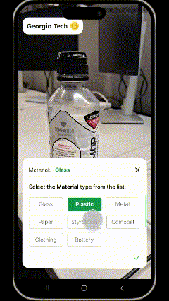
Users did not have power to change the AI material prediction.
-
The red and green indications weren't clear.
-
Users wanted more item 'tags' as options


$5 gift card
-
Most items resulted into 10 points and maximum the user can get is 15points.
-
With an average of 10 points per recycling, users think that they had to recycle 35 times to earn a $5 gift card -which in their opinion was too much effort for $5.
10+ In-person Interviews: highlights challenges faced by first time users with user interface and user flow of the app.
To validate the technical and usability challenges, I organized an in-person usability test at Georgia Tech for first-time app users.
Goal: To understand how first time users navigate through the app and what are their impressions on 'item submissions'.
10+ Participants were asked:
-
To login to the app.
-
To complete recycling session for 1 item.
-
To navigate to the recycling history.
Post the task, they were asked about their thoughts and feelings of app usage and whether they would be using the app in the future.
Key observations included:
Login: Users were hesitant to add their profile picture and birthdates. And they preferred quick login using google or apple.
Recycling with Ecgo:
-
It was observed that 60% participants were confused between recyclable vs. non-recyclable tags – The green and red border were not intuitive.
-
80% participants did not read the pop-ups. It was evident as they did not know what to expect next.


-
Misalignment between users' mental models and the app’s user flow – The navigation and task flow did not match user expectations for recycling. The new users asked "is that all?" when they submitted item on the app.
Sum-Up: User Journey highlighting user actions, feelings, painpoints, opportunities and potential solutions
Mapped current user journey highlighting user feelings, painpoints, opportunties and potential solutions.

85% participants admitted that rewards page motivated them to recycle.
Rewards effectively motivate users to recycle more. Users felt that they should get more value for recycling an item.
78% users mentioned that they were frustrated when app did not show correct material prediction.
The app allowed only 7 submission sessions at a time and mostly crashed which led them to restart the recycling process.
62% participant mentioned that the location on the app were limited.
The app's location feature lacks detail, only indicating nearby buildings without helping users find specific receptacles.
Inaccurate location data prevents users from finding locations effectively.
Suggestion for more submission areas
How might we redesign the 'Add Item' flow, reducing the end user frustrations and increase the engagement.
We prioritized opportunities based on feasibility (team resources) and impact. One of the immediate priorities was to empower users to change AI predictions, enhancing their overall experience. I proposed UI designs that would:
-
Allow users to manually correct AI misclassifications.
-
Make recycling feedback more visually prominent.


Ideation through Paper-wireframes


Prototype
Lo-fi wireframes
Learnings
-
I learned that I need to prioritize business goals and align my solutions around it, this may not be the best solution, however it is the best solution at the moment.
-
I realized that emotional framing and intrinsic motivation can drive stronger engagement than transactional rewards alone.
-
Through user interviews and behavioral data, I discovered that some of the biggest pain points weren’t technical—they were emotional, like users feeling isolated or unmotivated.
-
Running usability tests showed me how easily mental models can misalign with app flows, leading to friction even in seemingly simple tasks.
-
Most importantly, I learned to design for real behaviors, not just ideal ones—understanding that some users recycle on the go while others batch it helped me think more inclusively about different user journeys.
Coming Soon
Sneak Peek: I facilitated a co-design workshop to define new user journey and brainstorm ideas around incentives and leaderboard.
